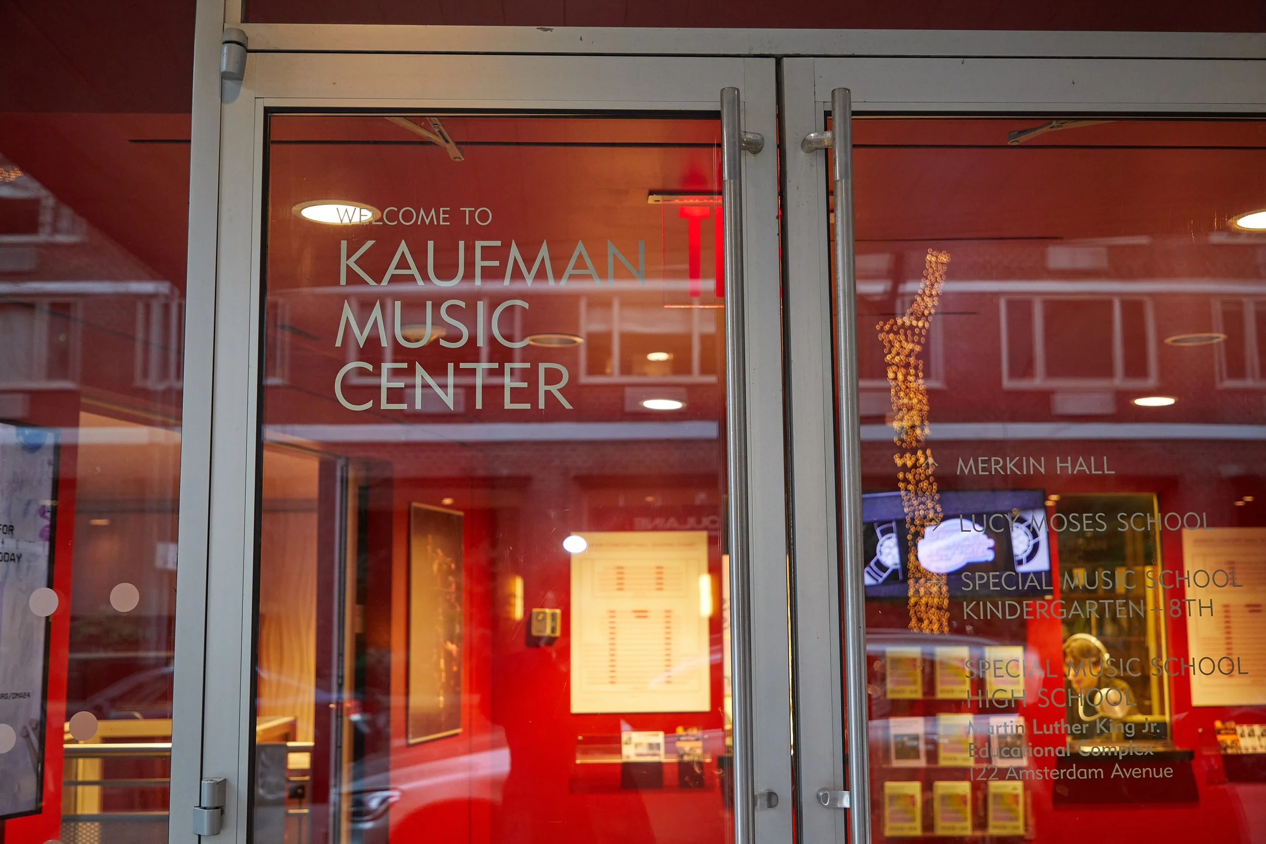
Visual brand refresh and seasonal campaign strategy for a nonprofit performing arts and music education institution.
To strengthen its presence and adaptability across diverse audiences and events, this project revitalized the brand identity of Kaufman Music Center, a nonprofit arts and music education organization located in NYC. The goal was to create a flexible and cohesive visual framework that could evolve seamlessly while maintaining a sense of community and artistic integrity. As the brand manager and graphic designer, I helped develop the strategy for the refresh and seasonal campaigns. I created the key visual assets, ensuring the new identity was both strategic and visually consistent.
Through a targeted overhaul of the logo system and website, we shifted the brand from a scattered, overwhelming identity to one that is adaptable, user-friendly, and aligned with the organization’s mission to inspire engagement and accessibility. One of the main challenges was balancing the need for a versatile system with preserving the vibrancy and individuality of the organization’s creative community, resulting in a more cohesive and engaging experience for patrons and performers alike.
Client
Kaufman Music Center
Role
Brand Manager & Senior Designer

Refreshed logo suite
The new logo suite includes more variants but fewer colorways. This allows the brand to expand and adapt to any event, presentation, or campaign and provides more flexibility year over year. By distilling and then re-expanding visual elements I was able to construct a flexible system where the brand serves as a framework.
Logo suite BEFORE the refresh.
The previous logo system was vibrant and interesting but challenging to use consistently across different products. It was very dominant and tended to overshadow the artists, campaigns, or initiatives. Simultaneously the system decentralized Kaufman and highlighted divisions, causing some confusion amongst patrons.
Change everything except the color, typeface, or logo.
The goal of the refresh was to emphasize Kaufman as the parent organization amongst its divisions and engage a wider, more active audience.
Significant challenges included balancing the creative visions of featured artists and leadership while working within budget limitations. Consequently, the brand elements had to be made more consistent while maintaining existing elements found at the physical location.
Website home page BEFORE and AFTER refresh.
Within the limitations of a stringent budget, simple but impactful changes were made to the website. Dark colors were removed at the top of the page and images now stretch to the edges to create a cleaner design to better highlight artists or events.
Flexible skeleton brand to emphasize the season theme.
A framework system gives each season a unique identity, creating an exciting experience for the audience while maintaining the comfort and familiarity of core branding elements.
Takeaway
During my 6 years at Kaufman Music Center, I navigated the complex task of reimagining the brand within an eclectic arts community. Balancing diverse creative voices across different programs became a constant endeavor. As the sole designer, I honed my skills in harmonizing these visions while maintaining a cohesive brand identity and laying the groundwork for ongoing brand enhancement.