
Kaufman Music Center
Brand refresh and seasonal campaign strategy for a multi-division performing arts and music education complex.

COMING SOON
2023–24 Season
Seasonal branding and campaign for a performing arts complex and concert venue.
Day of Musical Action
Event branding for a community fundraiser benefiting music education programs for kids, teens, and families.

COMING SOON
Kaufman Music Camp & Retreat
Branding and creative marketing strategy for a summer music camp and retreat for all ages.


Spring Gala
Event branding for a formal fundraiser benefiting Kaufman Music Center.

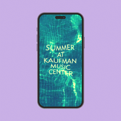
Summer in the City
Seasonal marketing campaign for a community music school.
COMING SOON
Rad Studio Space
Branding and creative marketing for a boutique arts venue and rental property.
Dahlia Dance
Branding and web design for a children’s dance and entertainment service.


University of Illinois at Chicago
Information design and marketing campaign for a university technology licensing office.
Content Creation
Short-form video content edited and ideated for social media.

Summer Nights
Digital cover art, posters, and social media assets for a series of Spotify playlists.
i love when women.
Digital collage series featuring iconic women from classical-style paintings.
Graphic Designer
Art Director

Visualizer


Environmental graphic design.
Environmental graphic design.

Seasonal large format window signage for music center.

Award wall display for a university STEM licensing department.
Work
Brand Manager & Visual Designer
Jan 2019 – Present
Kaufman Music Center (New York, NY)
Perform as lead designer and brand manager, servicing administrative staff, executive leadership, and the center’s performance and educational divisions.
Develop distinct event identity systems and produce materials for 10-20 fundraising events a year, including the 2022 Day of Musical Action, which, after rebranding efforts, raised approximately $20,000 over the fundraising goal, and an annual spring gala that raises 25% of the center’s institutional budget.
Generate video and digital content for social media and fundraising events, utilizing various production skills i.e., video and basic audio editing, basic motion graphics, and visual storytelling.
Assist with copy editing and content creation for social media, resulting in the 2021-22 Season Announcement receiving 90% more engagement than recent posts at the time (Instagram Insights).
Identify opportunities to improve branding guidelines by assessing business needs and industry trends.
Manage projects and establish a positive working relationship with internal departments and external partners to ensure business needs are being met.
Graphic Designer
Sep 2016 – Aug 2018
University of Illinois at Chicago – Office of Technology Management (Chicago, IL)
Acted as web point person and information designer, providing CMS training and guidance to improve user experience, which included the creation of icons, infographics, and graphs.
Facilitated the transfer of branding materials, including the recreation of informational posters and the redesign of the WordPress website, to align with the newly branded university system.
Graphic Artist
Aug 2014 – Sep 2015
Whole Foods Market (Columbia, SC)
Created signage using hand lettering and illustration, to enhance store atmosphere, advertise product information, and maintain company branding standards.
Skills
Brand Management
Identity Systems
Video Editing
Social Media Content Cration
Visual Storytelling
Photo Editing
Typography and Layout
Publication Design
Information Design
Concept Communication
Lettering and Calligraphy
Illustration
Developing
Video Editing
Web Design / HTML and CSS
Motion Graphics
UX / UI (user-centered design)
Software + Equipment
Adobe CC: InDesign, Photoshop, Illustrator, Premiere Pro, After Effects
Other Design Software: Canva, iMovie, Glyphs, Figma
CMS: ExpressionEngine, WordPress
Website Builders: SquareSpace, Wix, GoDaddy
Email/Direct Mail: Klaviyo, Wordfly, Webtools
Computer Systems: Mac, PC
Education
Master of Design in Graphic Design
University of Illinois at Chicago
Aug 2016 – May 2018
Graphic Design Summer Intensive
Fachhochschule Nordwestschweiz FHNW (Basel, Switzerland)
Jun – Jul 2017
Bachelor of Arts in Music
University of South Carolina (Columbia, SC)
Minor in Graphic Design
Minor in Music Entrepreneurship
Aug 2011 – May 2015
“Senate passes tax bill with handwritten provisions in rush to finish”
—USA Today
It seemed there was a need for a Tax Reform Bill that includes sections for “comments and concerns”. Just hours before the bill was scheduled for voting, updated versions were being handed out with additional notes written in the margins of the document. Having a comments section in the format from now on would be beneficial and could serve a wider range of purposes than just revisions.
“Democrats are complaining because the bill has handwritten notes in the margins and is unsearchable.”
—Insider
design
I designed the 2017 tax bill to look like the original document, but in a font that is commonly used on traditional receipts. At first, I carefully formatted each page to resemble a receipt. However, as I progressed through the document, I became less meticulous and the format became messy and difficult to understand.
King Louise
‘Portrait of Louise de Kéroualle’, Peter Lely (1671–1674)
This painting features the renowned mistress of King Charles II of England, Louise de Kéroualle. Louise de Kéroualle held a significant historical role as the mistress to King Charles II, a relationship that influenced both court politics and her standing.
Cool Girl
‘Girl with the Pearl Earring’, Johannes Vermeer (1665)
The “cool girl” — a term pulled from the iconic “Gone Girl” movie monologue – is described as easygoing, low-maintenance, and effortlessly attractive, conforming to traditional gender expectations. The monologue exposes the societal pressures and unrealistic expectations imposed on women to conform to a specific mold.
Love Woman
‘Portrait of a Young Woman’, unknown (1700–1800)
This painting features a black woman in a style reminiscent of the iconic ‘Girl with a Pearl Earring,’ although it is unknown if this is intentional.
This representation challenges historical norms, emphasizing the rarity of classical paintings featuring black women portraying traditionally feminine qualities.
The word "love" was chosen for this painting because of the feeling it inspired when I saw it for the first time.
Simply put, I love when women.
Lost Venus
‘Birth of Venus’, Sandro Botticelli (1480s)
I interpret the artwork as a representation of the human desire for self-expression and identity. The overlaid word "lost" on the image hides parts of Venus' face, symbolizing the feeling of being lost in one's beauty or self-identity.
Graphic designer and digital artist currently creating solutions for a New York City-based classical music organization.
Lost Venus
The "Birth of Venus," a painting by Italian artist Sandro Botticelli completed in the 1480s, is often associated with the Renaissance fascination with classical mythology and the revival of interest in ancient art and culture. Beyond its historical context, I interpret the artwork as a representation of the human desire for self-expression and identity. Venus, depicted as a powerful and confident figure emerging from the sea, symbolizes the human yearning to assert one's identity and be accepted for who they are, regardless of societal expectations. The bright orange background emphasizes this theme, adding a sense of energy and passion. The overlaid word "lost" on the image hides parts of Venus' face, symbolizing the feeling of being lost in one's own beauty or self-identity—a theme I observed in the original painting. This intentional overlay serves as a visual commentary on the complex interplay between self-expression, identity, and societal expectations.
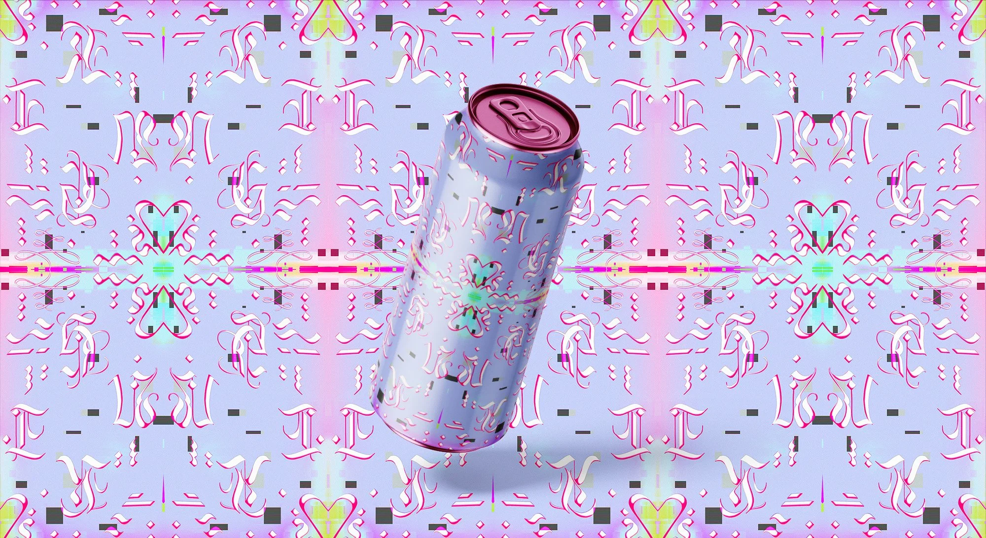
“Pio” Indie Rock Band
Logo & Branding System
Work In Progress
BUT FIRST. Storytime.
I have had the pleasure of working in the industry for approximately—depending on one’s interpretation of the industry—5–7 years, and over time my understanding of design history, visual communication, and theory has evolved. Though saying this all sounds so green, as there is so much more to learn…
Anyways…
About 9-ish years ago, before I would even dare call myself a designer, while I was completing my music degree and studying graphic design as a hobby, I offered design work to any of my music classmates who would take it. Charging around $40–50 per project—just enough to almost fill my gas tank. There are countless projects and objects that should NEVER be seen again but, as I was building this portfolio, I stumbled upon this forgotten branding system and thought “wow I really fucked up.”
Let me explain…
By fucked up, I guess I mean I had failed to see the potential of this logo and brand. Now, I’m not suggesting I was re-inventing the wheel BUT there was potential here and I missed it.
The further I am able to remove myself from my work, the more can assess my strengths and weaknesses. What I once thought was great is, maybe, not so great anymore. And in areas where I once thought there was nothing, I now see so much potential.
So…
I have decided to rescue this logo and branding system from the depths of it'’s dark musty tomb to see if anything can come of it.
:)
The history of Blackletter—sometimes referred to as Gothic or Old-English (The Bertheau)—is varied and complex. Blackletter is highly referential but, it is difficult to identify the exact root of that reference. It can be associated with the dissemination of knowledge, due to its use in Gutenberg’s 42-Line Bible, newspapers across Europe until the late 1920s, and as wordmarks for many famous news sources such as The New York Times, Irish Examiner, and The Sydney Morning Herald, to name a few. Blackletter is also associated with German culture and, specifically, Nazism as German newspapers continued using Fraktur—perhaps the most ubiquitous Blackletter styles (Charchar)—even after its perceived obsolescence in post-Bauhaus Europe. The Nazi government embraced the type until 1941 when they denounced it as a Jewish font.
It is at this point, in many written Blackletter histories, that the story ends or is followed by a quick aggregation of images that often include the Corona beer bottle, Snoop Dogg’s California Times album cover, images of Mexican gang tattoos, goth metal logo marks, and Disney Land’s archway into the Magic Kingdom. But, it is this exact history that I find the most interesting and useful for designers, typographers, and pop-culture enthusiasts. Keeping up with the news has become en vogue due to the tumultuousness of the American political system. So, we are constantly seeing these Blackletter wordmarks grace the tops of our Twitter, TikTok, Facebook, and Instagram accounts, as well as, fashion collections from Kanye West’s Life of Pablo, to Gucci’s Spring 2016 menswear collection (Watamanuk), and the cover of Taylor Swift’s 2017 album, Reputations.